Data Visualization Forms in Kinetica
B. Kaan Karamete, PhD, is Senior Director of Engineering for Geospatial, Graph, and Visualization at Kinetica
In this tech note, we’ll examine various data visualizations in Kinetica. In general, a typical data set might have both spatial and temporal components, called spatio-temporal. The nature of the spatial data variation is usually continuous, i.e., no abrupt changes occur across the spatial buckets even though it is also not uncommon to have highly fluctuating data over space and time. We will come back to this notion when we cover video forms of data visualization. For now, we can safely state that a typical streaming data record is specified spatially on discrete points, i.e., as a longitude and latitude pair and temporally with a timestamp. A basic example of this kind may look like below: (using the Kinetica data formatting jargon)
xy|data|string|wkt, time|double
“POINT(38.88154 -77.11510)”, 1626248677
Where the time is specified since epoch for date time of the day this blog is written: 07-14-202. Unix epoch is calculated in seconds starting from the date 1970-01-01. To have any meaningful observation we will also need a scalar attribute with the spatio-temporal record. For instance, it may have the number of transactions aggregated at that point location, optionally using a specific credit card, or the number of taxi pickups and drops, or the number of twits, or simply the z elevations from the sea level (some of these may not have temporal components). The path of a flight can also be a good example for spatio-temporal data type as seen below with timestamps and trackids.
x|double|data,y|double|data,TIMESTAMP|double|data,TRACKID|string|data|shard_key|char64|dict
-95.34140, 29.98423, 0.00, 3550_3,
-89.39545, 23.90856, 1.12, 3550_3
In short, a typical data set may in general have columns of records in space, time and a number of scalar attributes. The data analyst is often interested in looking at this data set from a lens at a particular zoom level in terms of tiles or cells, or buckets to draw any meaningful observations. For instance, if what we are interested in is finding the total number of retail transactions in Arlington county using a particular credit card within a time range, any point based data within the county boundary needs to be aggregated. This is possible to do by filtering out data satisfying these conditions and geospatially intersecting it with the county polygon. Any spatial data within the county, filtered within the time range then needs to be aggregated. These types of operations are often carried out using SQL calls using a relational database and its OLAP processor such as the following SQL:
select sum(amount), count(*)
from sales, arlington
where sales.card = 'visa' and STXY_contains(arlington.wkt,sales.x,sales.y)

272.72999572753906   |  4
If we’d like to visually inspect the distribution of sales we could aggregate over spatial buckets directly without having to employ additional sql filters.
create or replace materialized view sales_h3_7 as
select st_geomfromh3(h7) as wkt, ct
from
(
    select stxy_h3(x, y, 5) as h7, count(*) as ct
    from sales
    group by 1
)
The resulting view sales_h3_7 would look like this:
H3’s 6 level buckets is one order of zoom level up and hence the quantization on coarser buckets happen to aggregate more than one original record (three to be exact) within the buckets as shown above (right).
Now, instead of quantization, we may want to look at the overall data distribution globally and not necessarily only where data exists. This requires us to interpolate the data. One easy and accurate way of interpolation is by inverse distance weighted averaging which is a common technique used in contour plots. The idea is that the impact of the existing data to the location where we seek the value is proportional to its distance from the point , i.e., the nearer data impacts more on the value than the farther distance ones. It is accomplished by the following formula:

Where f_j is an existing data scalar value at (x_j,y_j), and d_{ij} are the distances from (x_j,y_j) to (x_i,y_i) location where we seek the scalar value of variable u.
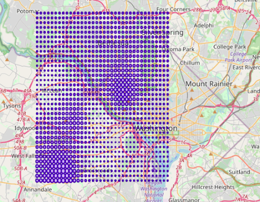
As you can see above, the bubble radius indicates how the scalar field ‘amount’ changes throughout the domain interpolated from the actual data values within the lattice of minimum and maximum range. The above interpolated data is obtained using the SQL statements depicted below; the statements can be customized by changing the name of the input table name, ‘sales’ to the user defined and the corresponding columns names, x,y, and amount to custom ones, respectively. The only other parameter used is the ‘bucket’ which is the delta for the interpolation bin (lattice) structure.
Figure: SQL way of inverse distance weighted averaging interpolation. The source is attached at the end of this document.1
Here it is chosen to be 0.005 (in degrees) which corresponds to roughly 500 meters bearing in mind that on the equator, 0.00001 corresponds to 1 meter approximately. The more granular the bucket value is, the more time it takes to compute the interpolations.
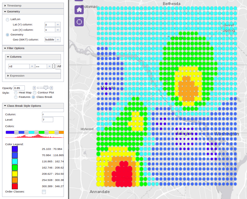
One more variation to the above visualization form could be by adding a color variation to emphasize the data spread not only with varying bubble radia but also with colors, proportional to the levels of the column ‘amount’, the scalar field variable. This is called ‘class breaking’ in our WMS call. Here is an example of applying color breaking on the ‘r’ column of the interpolated data, i.e., the ‘amount’ column in the original sales table:
Another form of visualization is contour plots. Contours are computed the same way as we did the interpolation as above, i.e., using the inverse distance weighted averaging method. However, the performance of finding the iso-lines corresponding to a specific level of the ‘amount’ column, i.e., the scalar value depends on the number of existing data points used per lattice corner interpolation. The concept of search radius is used for limiting the interpolating template (window) to a number of adjacent layers around the interpolated corner.
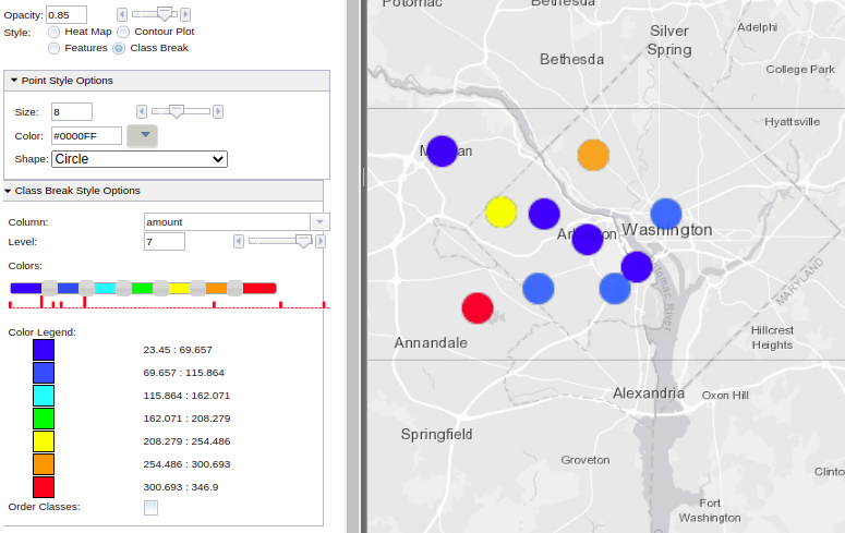
Another useful form of visualization is by streaming videos. Videos are a great way of observing how spatial data changes temporally. A variety of visualization styles can be applied at every video frame created by the views of the data filtered at that time of the frame. Therefore, videos can be generated from various visualization style options in Kinetica, such as class breaks, contours, heatmap, etc. These styles are applied over the data generated by the filtered views of the video manager, implicitly within the range (duration) of the animation. Generated byte stream is stored by an internal file system manager, and accessible via yet another get/video endpoint for video streaming capable web browsers to play it. If the duration of the video is selected to be 10 seconds with 10 frames per second, then expect the video manager to make 10×10 times internal filter view calls. Therefore, depending on the data size, generating videos can be quite a time consuming task. For this reason, create/video endpoint is an async call.
Our simple example can be used to generate a video out of a class break visualization style on the ‘amount’ column. The original data table is filtered using the ‘time’ column within the time range of the frame and a class break visualization is then applied over the filtered view. The frames are stitched together via an interpolation scheme for reducing intermittent motion for smoother streaming quality. Also, another useful parameter for animation is the ‘window’ option, with which one can keep portions of the prior steaming history visibly accumulated at each video frame, e.g., if we’d like to create a video from a travelling vehicle, and if the goal is to keep the entire path visible as the path moves with the speed of the animation, you’d want to make this ‘window’ option as large as the entire time range.

The above video can be streamed in any browser that can serve webm technology. Here is how:
<!DOCTYPE html>
<html>
  <body>
     <video controls>
       <source    src="http://localhost:9191/get/video/sys_temp/video-test_cb_video.webm">
     </video>
  </body>
</html>
However, track lines may probably be a better candidate for temporal movement, hence creating a video out of a track visualization style makes more sense. So, if we modify our sales table with additional TRACKID and TIMESTAMP columns, we can create videos that tracks the movements of the sales transaction temporally. Here is the modified sales table:
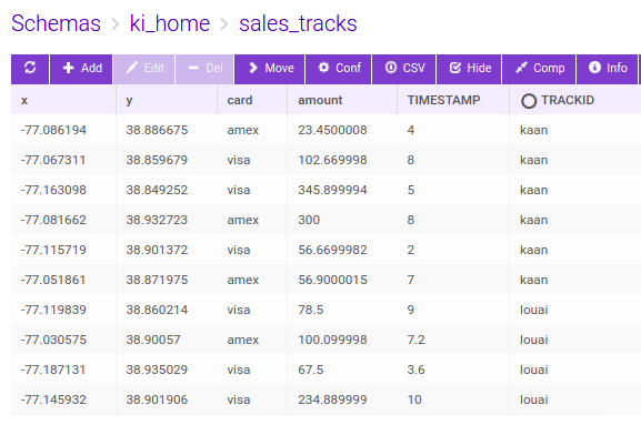
We can also combine class breaking style over the tracks based on the trackid, i.e., ‘kaan’ and ‘louai’ in our example. We can then set the video parameters and styles with different track head shapes as below:

Figure: Python calls for create video API using tracks and class break visualization styles, source is appended at the end of the document.4
For demonstration purposes, we’ll now look at a flight tracking problem for multiple supply chain logistics. There are two airport hubs as supply side, namely Houston and Washington and a total of five aircrafts making covid vaccine distributions to 14 demand locations in the world capitals.
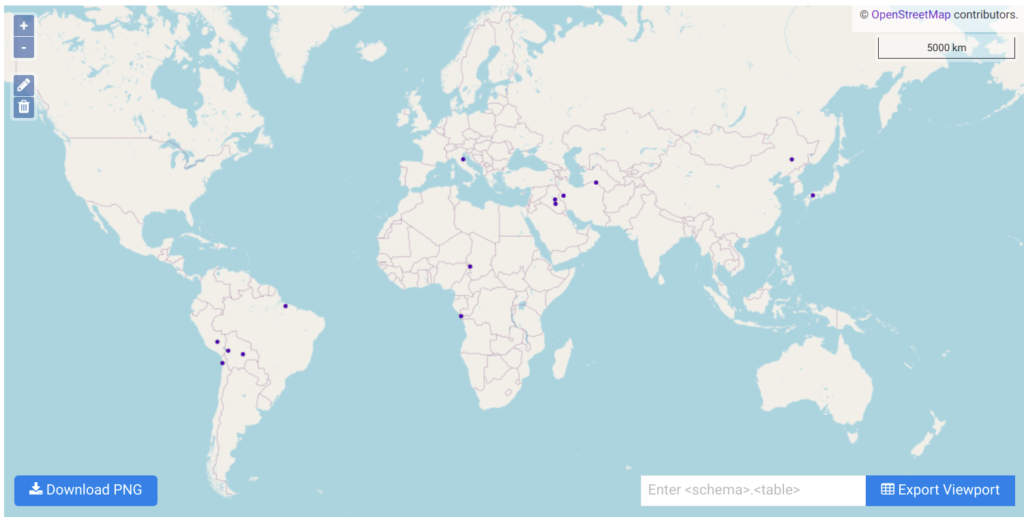
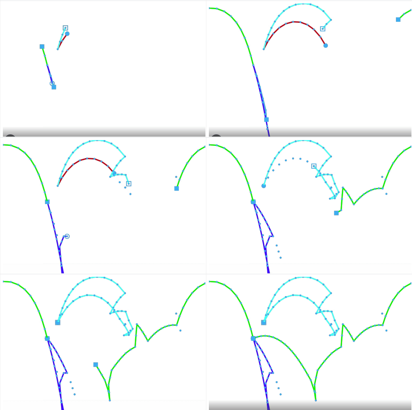
Figure: Vaccination delivery by 5 aircrafts from two supply hubs to 14 destinations – track frames are generated using create/video – Source code is attached at the end.3
We have seen so far visualizations on the server side via WMS calls, and the concatenation of filtered views in terms of video streams, there are also client side rendering options available in Kinetica, namely, WFS and VTS (vector tile service) services. The user’s own CSS styles and rendering properties to various features in the geometry can be associated by client side rendering. The server sends geometry and attributes (map of features to geometry) in protobuf or JSON format, and the client renderer knows how to consume and display it on distributed architectures. Here is an example of that:
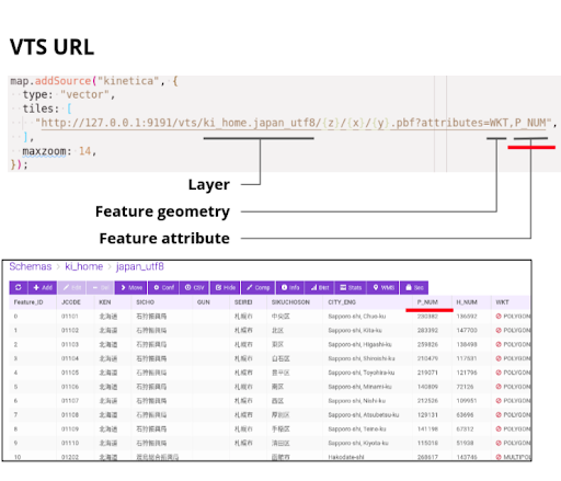
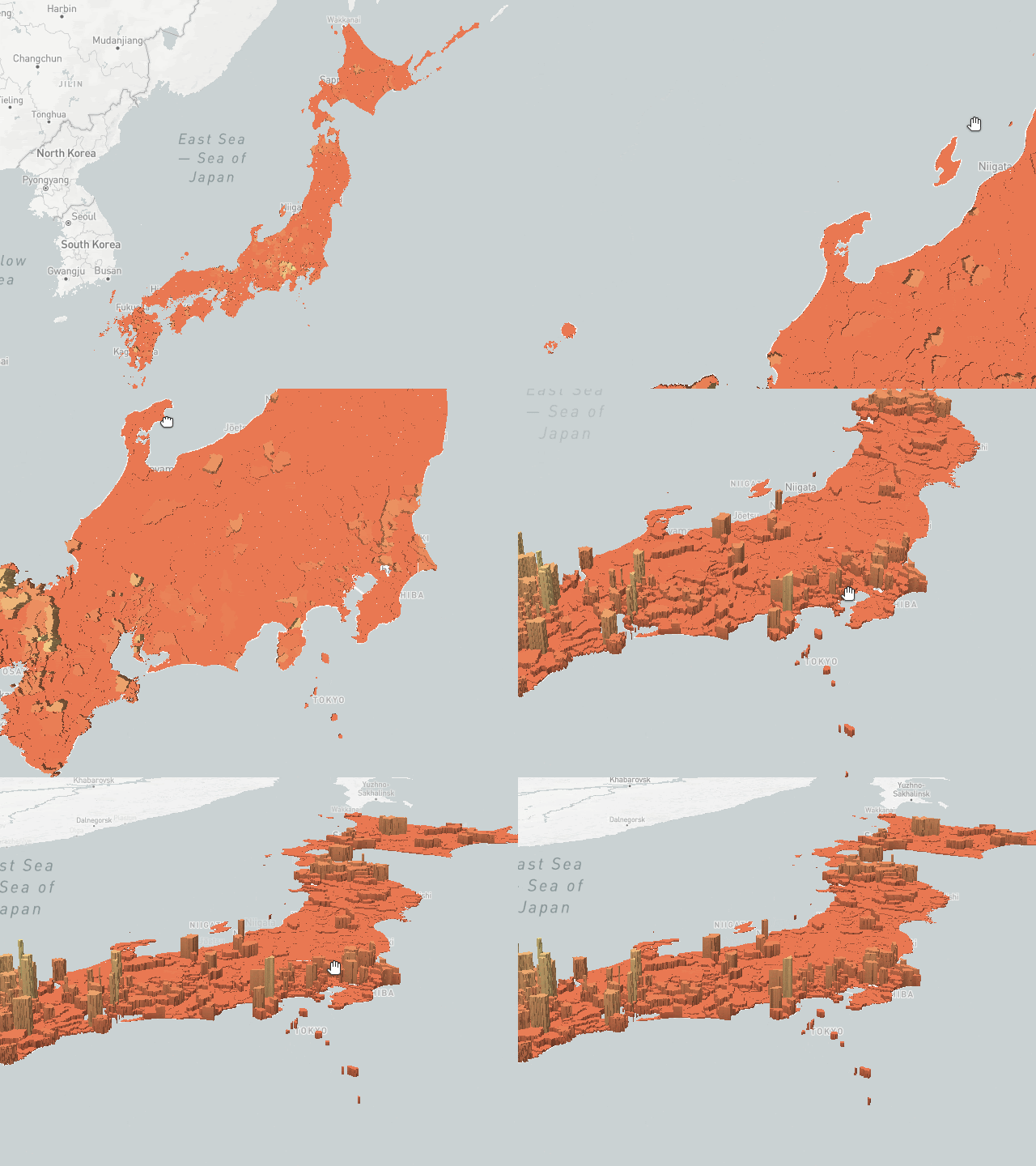

Figure: VTS client side rendering, source is at the end of the document.4
Yet another visualization form supported by Kinetica is the embedded SVG content with animations for the MSDO (multiple supply demand solver) solver. The above class break track video for the vaccination distribution can also be created directly from the solver endpoint by setting these options:
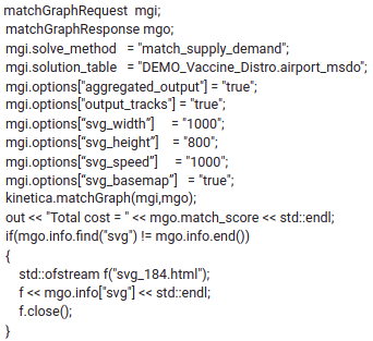
The response’s info field is a string of embedded SVG content html with CSS and animated motion paths. The speed of the SVG animation can be adjusted to be practical and be able to track and simulate real time logistics. It is important to note that the video speed is directly proportional to the weights of the underlying graph, i.e., the results can directly be used in tracking and scheduling of deliveries in real time. See SOURCE CODES section for the html file with SVG scripts. Here is what we get when we load the solver generated html file into an internet browser – Red dots indicate the delivery aircrafts originated from two airports and black circles are the destination (demand) airports.
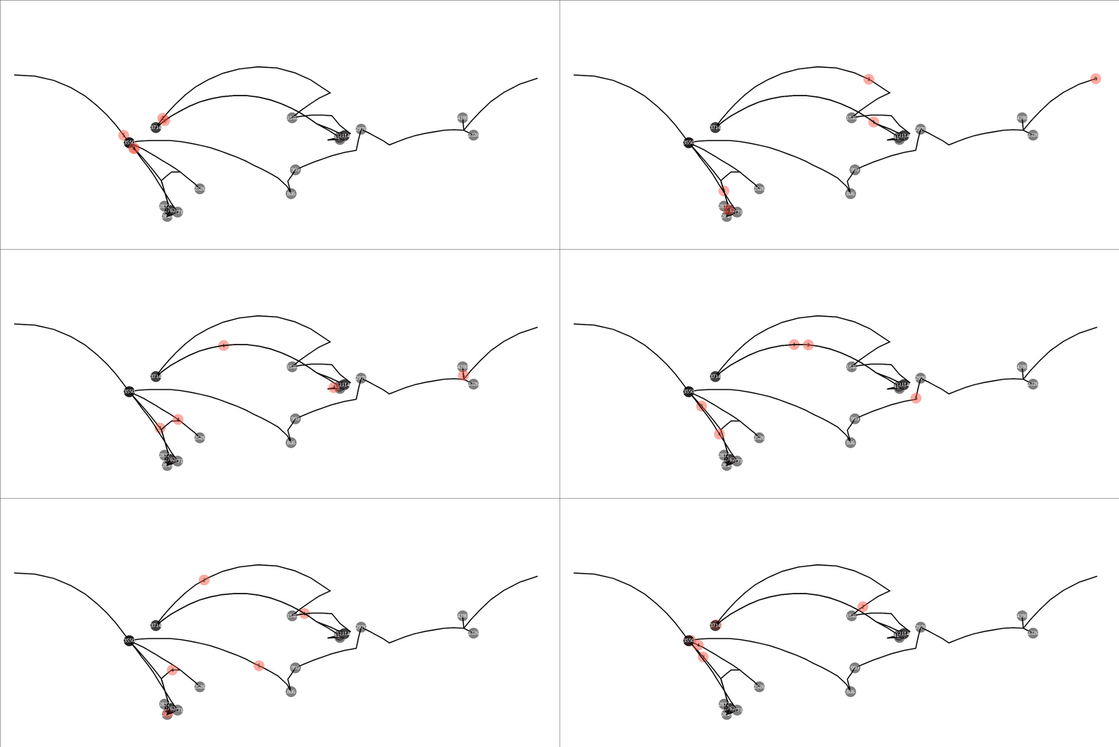
Figure: SVG animation embedded html file as output of /match/graph’s supply demand solver. The path animation is shown per flight from IAD and Houston to various world capitals. Source is at the end of the document5
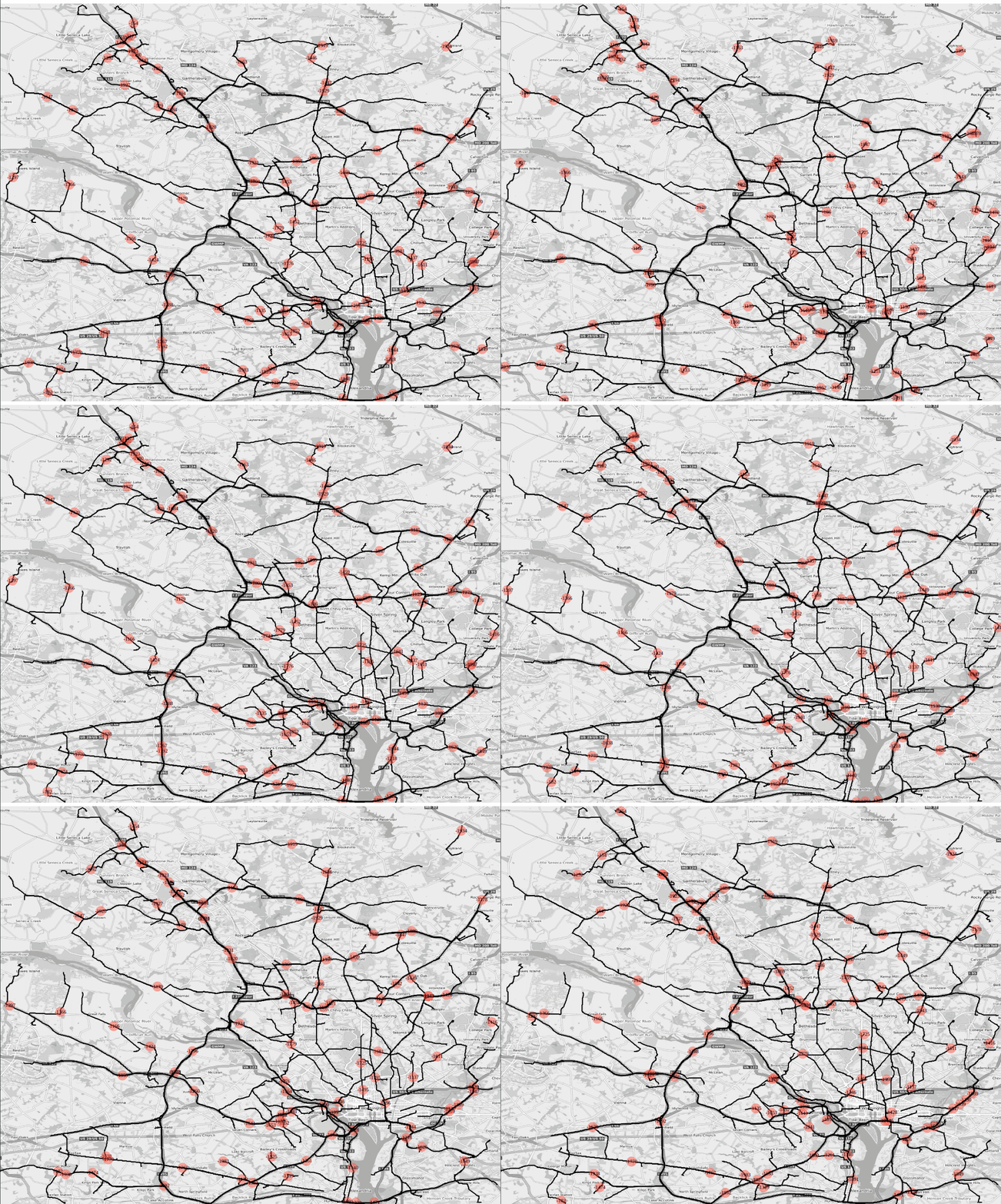
Figure : SVG animation embedded html file as output of /match/graph’s shortest path batch solver; dc road network 100 pairs are selected that are 3km apart from each other, and ‘svg_speed’ option is set to x20, i.e., the animation speed is 20 times faster than the actual travel speed.
Last but not least, the isochrone visualization pattern; it is the combination of graph solve and contour interpolation. From a single source location, we find all the reachability lines (ischorones) at constant iso levels. If the weight of the graph is in time, it is truly an isochrone. Isochrones can be used finding accomodation within the optimal distance to the airports and businesses, or disaster recovery teams that can reach out within minutes to the danger zones, Kinetica provides a fast and accurate solution utilizing our in-house graph solvers. (https://docs.kinetica.com/7.1/graph_solver/network_graph_solver/) The solution is rendered as isochrone contours using Kinetica’s distributed visualization engine, and the results can also be exported as images or vector layers (WKT Polygons). Here is an example of metropolitan DC area ischrones originating from the Kinetica headquarters.
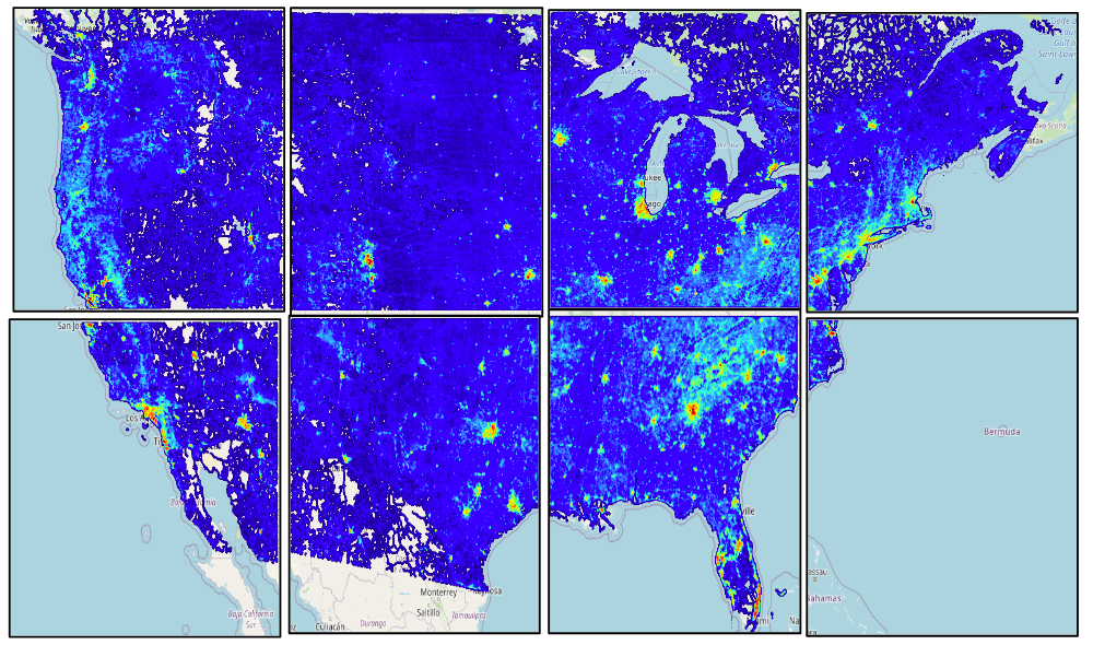
Yet another one of the most common visualization patterns is the heatmap which is our fastest form of visualization. It shows billions of records in milliseconds – showing the density of the data using convolution. The color coded heatmap is an indication for the number of records but not how those records’ scalar values imply However, it is a great way to distinguish heavily hit areas, such as looking at the entire US road network heatmap, one can quickly notice the metro-politan areas as seen below:
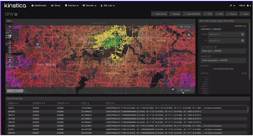
The last mention deserves to be the most frequently used visualization form, i.e., the visualization of geometrical primitives; polygons, lines, points, etc. All WKT type geometry constructs are supported by Kinetica. Our BI tool around Reveal framework consumes all these different types of visualization patterns(endpoints) in an intuitive data analysis and exploration UI tool. One million source to destination pair shortest paths are shown in class break form with colors proportional to their distances from the destination location below (https://docs.kinetica.com/7.1/analytics/reveal/):
The REST endpoint schemas and their corresponding R/C++/Python/Java/JavaScript APIs can be found with extensive tutorials and examples in the online Kinetica documents mentioned here (https://docs.kinetica.com/7.1/).
SOURCE CODES:
CSV files used to create database tables:
https://drive.google.com/file/d/1uvrpLoNjDum_lmPssnAFwaHdHV7qg90B/view?usp=sharing
https://drive.google.com/file/d/1m7hDvFKlreSJHn7f4Cm85RFfl7FD0r4g/view?usp=sharing
1Inverse distance weighted averaging interpolation via sql statements:
https://drive.google.com/file/d/1yJmDeunTc197NwZ4TOgBC-CbOR-Yk08E/view?usp=sharing
2Generating video from class break visualization style:
Make sure kifs is enabled on the configuration file, e.g:
kifs.type = disk
kifs.base_path = /tmp/gpudb-kifs
Also make sure to create following directories accordingly before starting gpudb service:
/tmp/gpudb-kifs
/tmp/gpudb-temp-videos
https://drive.google.com/file/d/1-D9N3k8CfFvXU1GCD-dsEvxjkvwOdjoV/view?usp=sharing
https://drive.google.com/file/d/1VE6QmgmzlrBdGX4INlDQeMfaIQLKd6MF/view?usp=sharing
3Generating supply demand tracks and class break visualization style:
https://docs.google.com/presentation/d/10tNrUT6PpL1aU-llyRp3G3xtLX4yWanOoEFdygtREqw/edit?usp=sharing
https://drive.google.com/file/d/1EzTmfDGEL5WU5dep7Rt9ApKVC9qJ6MDS/view?usp=sharing
4Client side VTS visualization script
Make sure that the vts is enabled on the configuration before starting the gpudb service:
enable_vectortile_service = true
https://drive.google.com/file/d/1Ilnu0_1PvKOERQjzUqbE-Icp88cIJaxP/view?usp=sharing
5Client side VTS visualization script
SVG embedded html for the solution of multiple supply demand solver
https://drive.google.com/file/d/1rNBo8w9WPNpjJ4lR9jyrzWt81-ql5C4G/view?usp=sharing
Making Sense of Sensor Data
